Figma Components
What are Figma Components?
Figma components are reusable design elements that help you maintain consistency across your project. Once created, a component can be reused multiple times across different frames and designs.
When you update the master component, all instances of that component update automatically, ensuring a consistent design language throughout your project.
Benefits of Using Figma Components
1. Consistency and Uniformity
Components ensure that your design elements remain consistent. By using components, you can maintain uniformity across different parts of your project, from buttons and icons to entire sections of your UI.
2. Efficiency and Speed
Creating reusable components speeds up your design process. Instead of recreating elements from scratch, you can simply drag and drop existing components, allowing you to focus on the more creative aspects of design.
3. Ease of Maintenance
Updating designs is simpler with components. Changes made to the master component automatically propagate to all instances, ensuring your design stays up-to-date without manual adjustments.
4. Enhanced Collaboration
For teams, components make collaboration more efficient. Designers can work on different parts of the project while maintaining a consistent design language, reducing the risk of discrepancies and miscommunication.
Key Features of Figma Components
1. Master and Instances
Figma distinguishes between master components and instances. The master component is the original, editable version, while instances are copies that reflect changes made to the master. This system ensures consistency while allowing flexibility in design.
2. Component Overrides
Instances can be customized with overrides, allowing you to change properties like text, colors, and images without affecting the master component. This flexibility lets you tailor components to specific contexts while retaining their core structure.
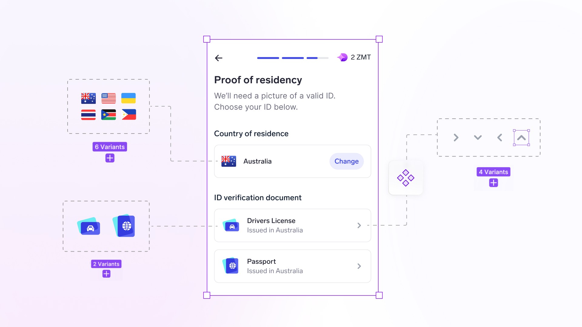
3. Variants
Variants allow you to group similar components together, making it easier to manage and switch between different states or versions. For example, you can create button variants for different states like default, hover, and active.
4. Nested Components
You can nest components within other components, creating complex, reusable design systems. This nesting capability helps manage large-scale projects with multiple layers of components.
Practical Use Cases
1. Creating Design Systems
Components are foundational to design systems. By defining components for buttons, input fields, icons, and more, you can create a comprehensive design system that ensures consistency across your entire product.
2. Prototyping and Testing
Use components to build interactive prototypes. Components allow you to quickly assemble and modify prototypes, making it easier to test different design ideas and iterate based on feedback.
3. Responsive Design
Components can adapt to different screen sizes and layouts. By combining components with Auto-layout, you can create responsive designs that adjust seamlessly to various devices.
How to Create and Use Figma Components
Step 1: Design Your Element
Start by designing the element you want to turn into a component. This could be a button, icon, card, or any other reusable element.
Step 2: Create a Component
Select the element and right-click to choose “Create Component” or use the shortcut Ctrl+Alt+K (Windows) or Cmd+Option+K (Mac). This action converts your design into a master component.
Step 3: Use Instances
Drag instances of the master component from the Assets panel into your design. These instances will inherit any updates made to the master component.
Step 4: Customize with Overrides
Customize instances as needed using overrides. Change text, colors, or images to fit the specific context of your design while retaining the core structure of the component.
Step 5: Organize with Variants
Group similar components together using variants. This makes it easier to switch between different states or versions, streamlining your design process.
Summary
Figma components are a powerful tool for creating consistent, scalable, and efficient designs. Components help you maintain a uniform design language, speed up your workflow, and enhance collaboration within your team.