Figma Auto Layout
What is Figma Auto-layout?
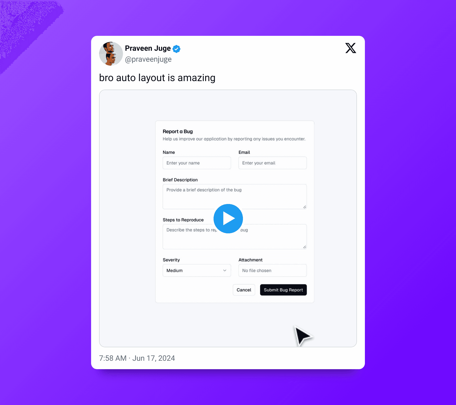
Auto-layout is a feature in Figma that allows designers to create dynamic, responsive components and frames that automatically adjust as content changes.
This tool helps maintain consistent spacing, alignment, and scaling, making it easier to create designs that adapt seamlessly across different screen sizes and devices.
Benefits of Using Auto-layout
1. Consistency and Flexibility
Auto-layout ensures that your designs remain consistent and flexible. By setting rules for spacing and alignment, you can create components that automatically adjust to changes.
2. Efficiency and Speed
Auto-layout significantly speeds up the design process. Instead of manually adjusting elements when content changes, Auto-layout automatically resizes and repositions them according to the rules you set.
3. Easier Collaboration
For teams, Auto-layout makes collaboration more straightforward. When multiple designers work on the same project, maintaining consistency can be challenging. Auto-layout ensures that changes made by one team member do not disrupt the overall design.
Key Features of Auto-layout
1. Direction and Spacing
Auto-layout allows you to define the direction of your layout—either horizontal or vertical. You can also set the spacing between items, ensuring consistent gaps regardless of content changes.
2. Padding and Margins
With Auto-layout, you can specify padding inside a frame and margins around it. This feature ensures that elements have the right amount of breathing room, enhancing the overall design's readability and aesthetics.
3. Alignment
Alignment settings in Auto-layout let you control how elements are positioned within a frame. You can align items to the left, right, center, top, or bottom, giving you precise control over the layout's appearance.
4. Resizing Options
Auto-layout provides flexible resizing options. You can set elements to 'hug contents' or 'fill container,' allowing them to adapt dynamically to content changes or container resizing.
How to Use Auto-layout in Figma
Step 1: Create a Frame
Start by creating a frame that will contain the elements you want to manage with Auto-layout.
Step 2: Add Auto-layout
Select the frame, then click on the "Auto-layout" button in the properties panel. Choose the direction (horizontal or vertical) and set the desired spacing.
Step 3: Add Elements
Add the elements (text, images, buttons) to your frame. They will automatically align and space according to the Auto-layout settings.
Step 4: Customize Padding and Margins
Adjust the padding and margins to ensure your elements have the right amount of space around them.
Step 5: Set Resizing Options
Choose how each element should resize within the frame. Set elements to 'hug contents' or 'fill container' based on your design requirements.
Conclusion
Figma's Auto-layout is a powerful tool that can transform your design workflow, making it more efficient, consistent, and collaborative. By understanding and leveraging the features of Auto-layout, you can create responsive, adaptable designs that enhance user experience across different devices and screen sizes.