Figma Color Palette
What is a Figma Color Palette?
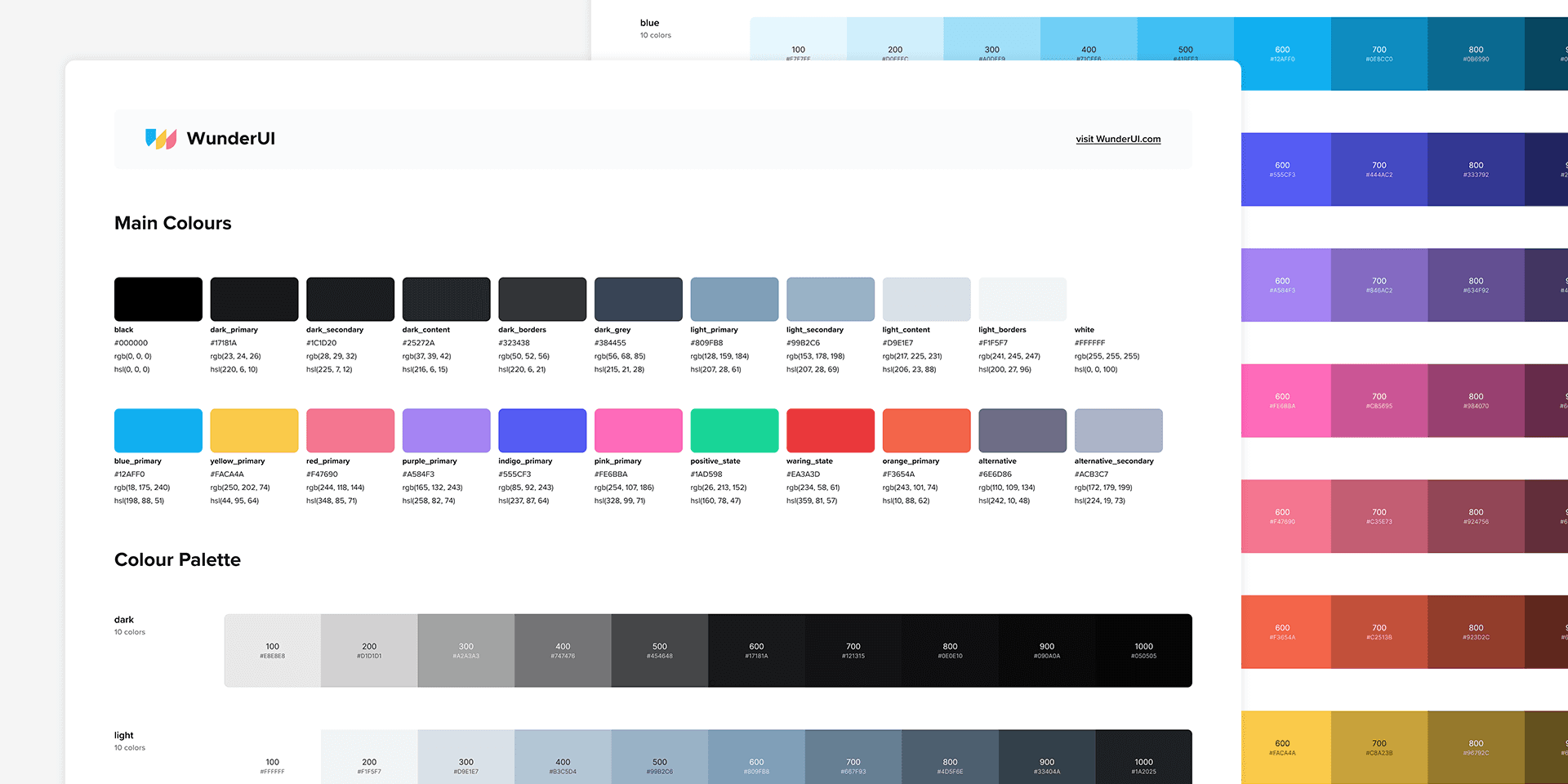
A Figma color palette is a collection of colors that you use throughout your design project. By defining a consistent set of colors, you can maintain consistency across your designs, making them look more professional.
Benefits of Using Figma Color Palettes
1. Consistency Across Designs
Using a defined color palette ensures that your designs are visually consistent. This uniformity is crucial for maintaining a professional look, especially in large projects with multiple elements.
2. Efficient Workflow
Figma’s color palette tools streamline your workflow. By having a set palette, you can quickly apply colors to your designs without having to manually pick or input color values each time.
3. Brand Identity Maintenance
For brand-focused projects, maintaining consistent color usage is essential. A color palette helps you adhere to brand guidelines, ensuring that your designs align with the brand’s identity.
Key Features of Figma Color Palettes
1. Global Colors
Global colors in Figma allow you to define a color once and use it throughout your project. Any changes made to a global color will automatically update all instances of that color in your design.
2. Color Styles
Figma’s color styles let you create reusable color settings for fills, strokes, and effects. These styles can be applied to any element in your design, ensuring consistent color application.
3. Gradients and Opacities
Figma supports gradients and varying opacities, allowing you to create rich, dynamic color schemes. You can save these as part of your color styles for consistent use across your project.
4. Color Libraries
You can create and share libraries in Figma, making it easy to maintain a consistent color palette across multiple projects and teams. This feature is particularly useful for large organizations with established brand guidelines.
How to Create and Use Figma Color Palettes
Step 1: Define Your Colors
Start by defining:
Primary color
Secondary color
Accent color
Consider the brand guidelines, target audience, and overall design aesthetic when choosing your colors.
Step 2: Create Color Styles
In Figma, create color styles for each of your defined colors. Go to the right-hand panel, click on the color box, and choose “Create Style.” Name your style according to its purpose (e.g., Primary Color, Accent Color).
Step 3: Apply Color Styles
Apply your color styles to elements in your design. Select an element, click on the fill or stroke color in the right-hand panel, and choose the appropriate color style from your list.
Step 4: Use Global Colors
For colors that need to be used universally across your project, define them as global colors. This ensures that any changes to the color will automatically update all instances, maintaining consistency.
Step 5: Share Color Libraries
If you’re working in a team, create and share a color library. Go to the Assets panel, click on the library icon, and choose “Create Library.” Add your color styles to the library and share it with your team.
Summary
Figma color palettes are a powerful tool for creating consistent, appealing, and professional designs. By mastering color palette features, you can enhance your design process, maintain brand consistency, and improve the visual appeal of your projects.