How to Design Great Mobile Apps: A Beginner's Guide

Vlad Solomakha

Feb 4, 2024

Jump to

Title

Jump to

Title

Generate UI designs and wireframes with AI

Get an overview of the key aspects of designing iOS and Android apps. From platform nuances to the tools that will help bring your vision to life.

Get an overview of the key aspects of designing iOS and Android apps. From platform nuances to the tools that will help bring your vision to life.

Getting started 

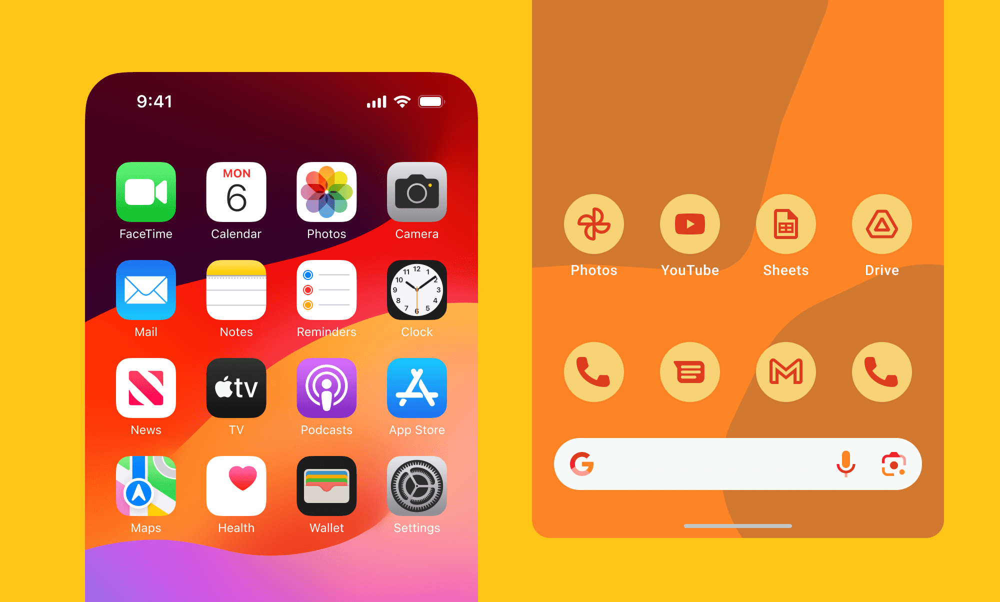
A good starting point in designing a mobile app is learning platform guidelines. Both iOS and Android come with their own set of design patterns that specify details of how your app should look and behave. 

Guidelines help you speak the same visual language as your users. They ensure that your app feels like a native and provides a familiar experience. 

It's up to you to which extent to follow them. Many big apps like Airbnb and Uber feel native while bringing their own unique visual style. But if you haven't designed any app before, I suggest you follow them as close as you can. It will help you get a sense of each platform.

iOS Guidelines
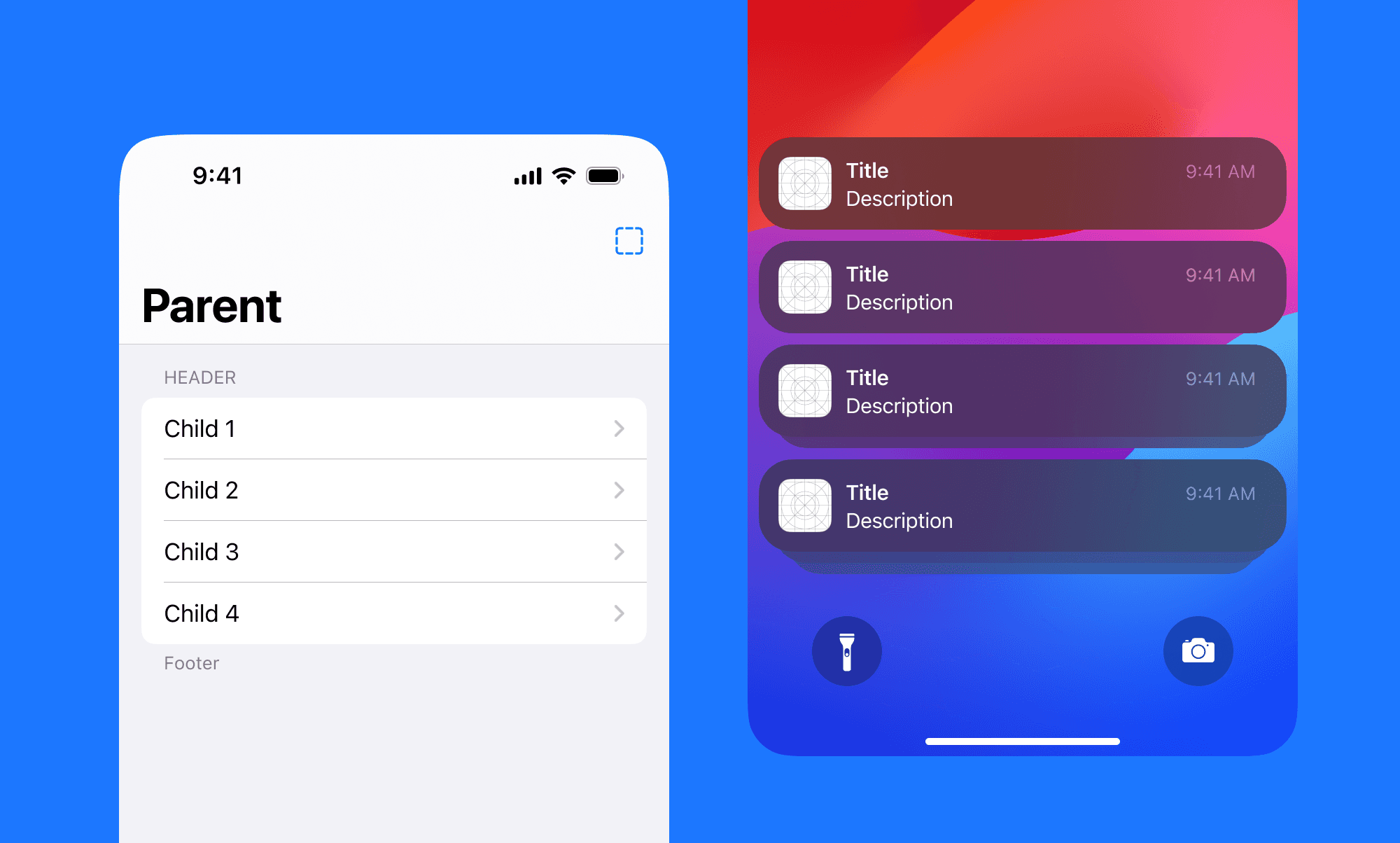
iOS guidelines are part of broader design guidelines from Apple - Human Interface Guidelines or HIG. They are the blueprint for designing intuitive and visually appealing interfaces for the Apple ecosystem. HIG advocates for simplicity, ease of navigation, legibility of text, intuitive use of UI elements, and a focus on content. 

To get started, I recommend this 6-minute WWDC video and going through their website. Another great way is to dive deep into the UI kit of iOS and play with combining different components.

Android Guidelines
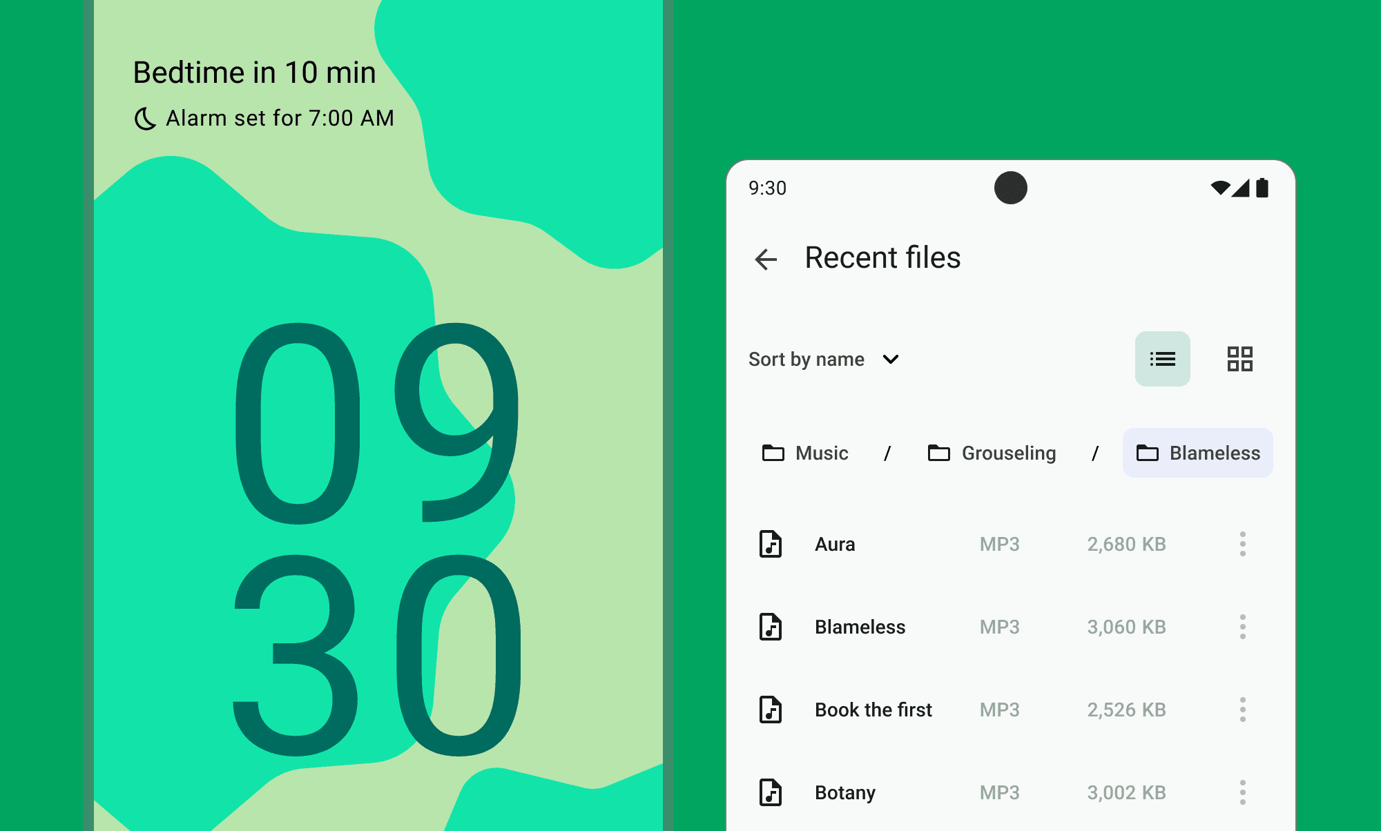
Just like Apple, Google has its own design language and patterns called Material Design. It encourages the usage of bold colors, graphic elements, and motion to create a hierarchy of information and actions. 

Material uses depth to convey the importance of elements through elevation and shadows. This approach aims to make apps more intuitive with visual cues that respond to touch in a way that mimics the physical world. 

Google created a dedicated website where you can explore guidelines and learn about components.

Design Tools

Just as a painter needs brushes and a canvas, an app designer needs the right tools. Figma and Sketch have become the go-to editors for designers. They have pretty high learning curves but provide powerful functionality once you master them.
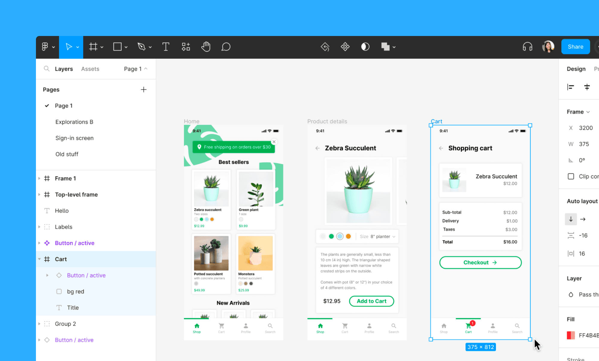
Both are vector-based, and you can design everything, from icons to complicated multi-screen interfaces. Both have an extensive plugins ecosystem. Figma is browser-based and can be used on any Mac and PC, while Sketch is available only on Mac as a native app.
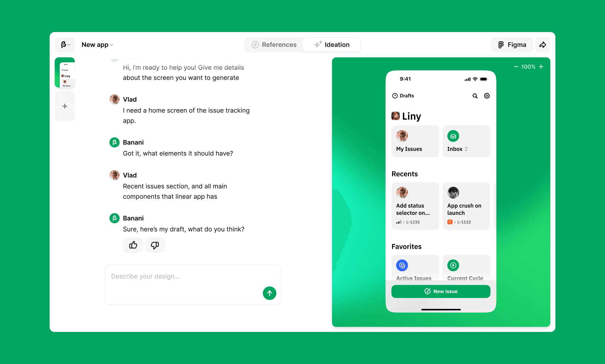
Next tool I highly suggest trying is Banani. It's an AI that generates the UI of mobile apps from simple text prompts. You can explore different ideas within minutes with no need to spend hours learning editing software. 
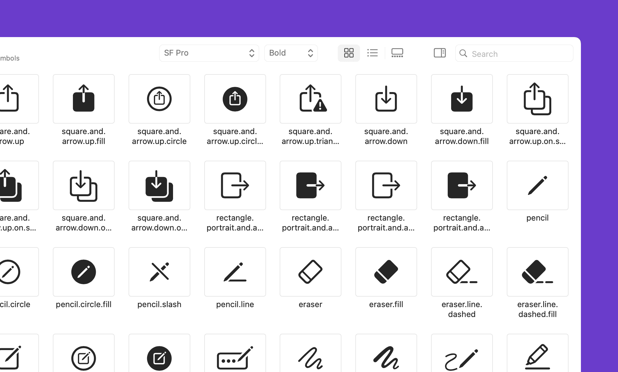
When designing the app you will definitely need icons. Apple released a dedicated app called SF Symbols. With it, you can find any icon you might imagine or need for your project.

UX Basics

As with any interface design, good mobile design is about solving user problems in the best way. An app should maintain a consistent look and feel throughout, use simple and direct language, and provide immediate feedback to users' actions.

Nngroup is a wonderful resource for learning design patterns, information architecture, interaction Design, and many other UX-related topics.

Growth.design has an amazing collection of case studies in the form of interactive comics. They take a closer look at apps that we use day to day. I often come back there to refresh some psychological principles even though I'm a seasoned designer.

Remember, every design element on the screen serves a purpose. From color choice to typography. Elements should work together to guide the user through the app, making the complex feel simple.

Inspiration
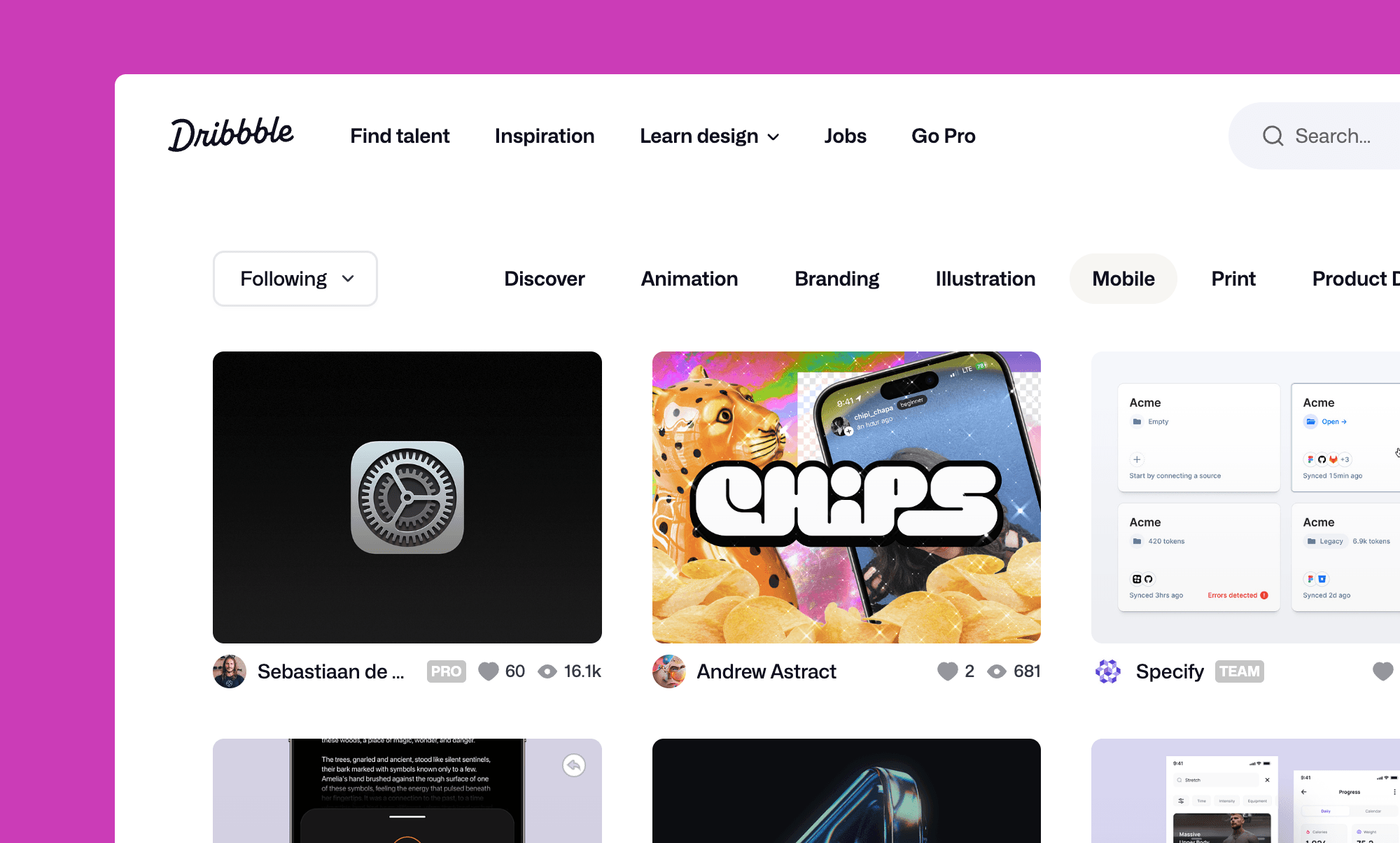
Finding references and staying inspired is a big aspect of any design work. It helps you find the best patterns and keeps the flow of ideas.

Designers post their works on platforms like Dribbble and Read.cv. Aside from references, they can be a great introduction to the design community. Pinterest, even though not focused on interface design, is amazing for finding any visual inspiration.

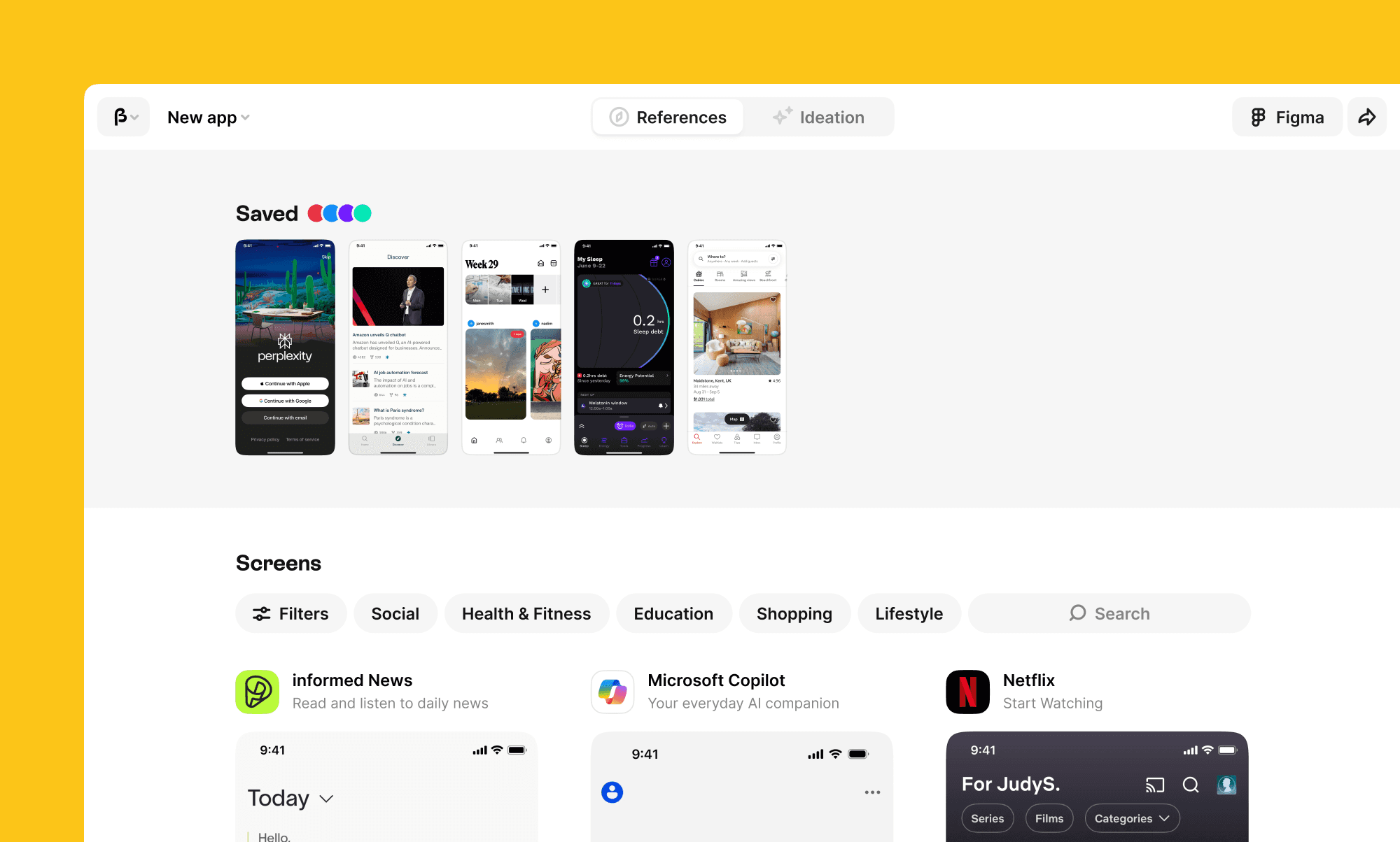
Often it's better to reuse established patterns rather than invent a wheel. For this purpose, I suggest Banani. It has a collection of more than 100,000 screens from other apps, that you can use as inspiration and starting point.
Summary

Beauty of design is seeing your ideas becoming a reality. I hope this article gave you an overview of where to start to design a mobile app :)

If you want to dive deeper into UX, I also created an overview of key UX design laws and principles.

Generate UI designs using AI

Convert your ideas into beautiful and user-friendly designs. Fast and easy.